How we covered ET Telecom’s full range with one design system.
Dreamjar for ET Telecom

How we covered ET Telecom’s full range with one design system.

About

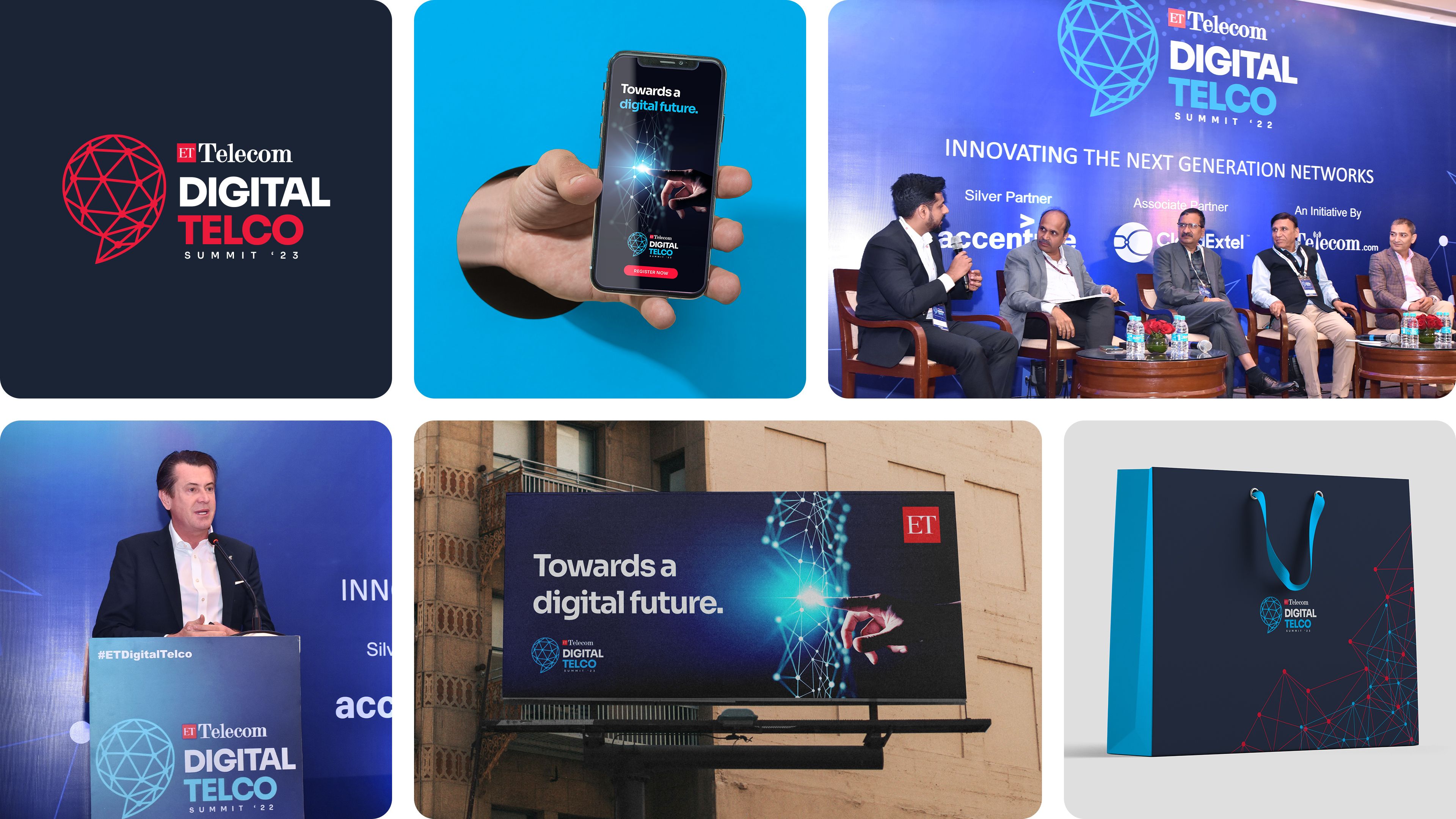
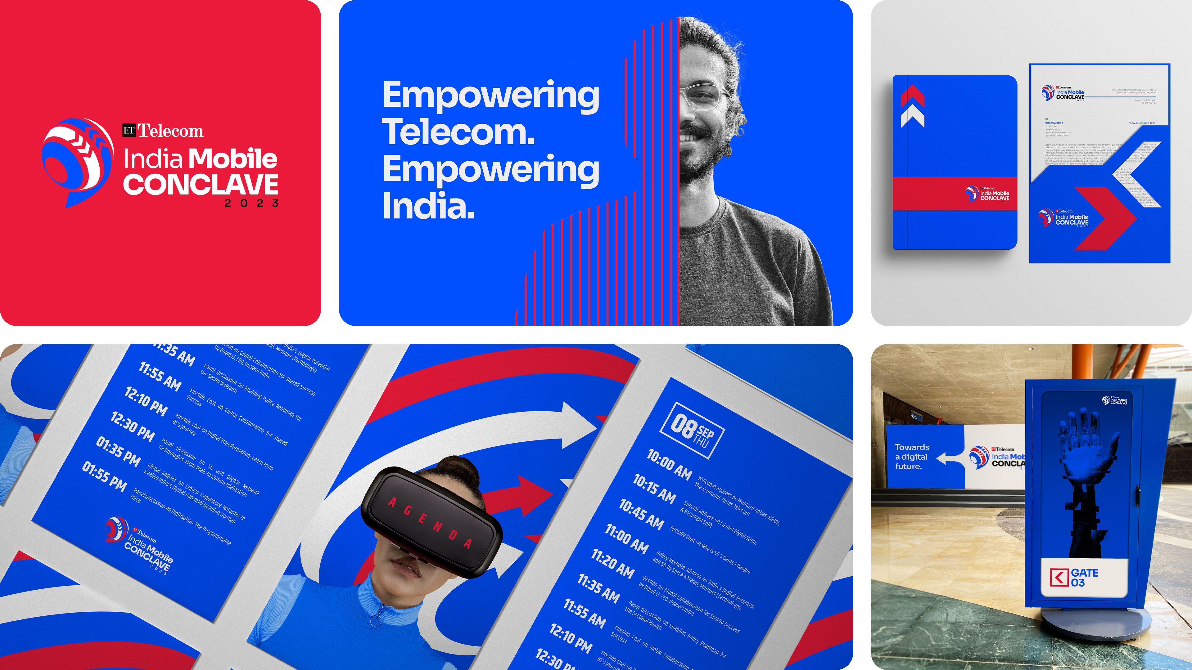
ET Telecom is one of India’s most trusted platforms for telecom and technology dialogue. Backed by The Economic Times, it leads conversations that shape the country’s evolving telecom landscape. Through flagship IPs like 5G Congress, Digital Telco, India Mobile Conclave and ET Telecom Awards, it connects decision-makers, innovators and policymakers to drive industry insight and progress.


BrandingVisual Communication

Detailed Scope

Brand Identity Design
Sub-brand Architecture
Visual Language Development
Communication Framework
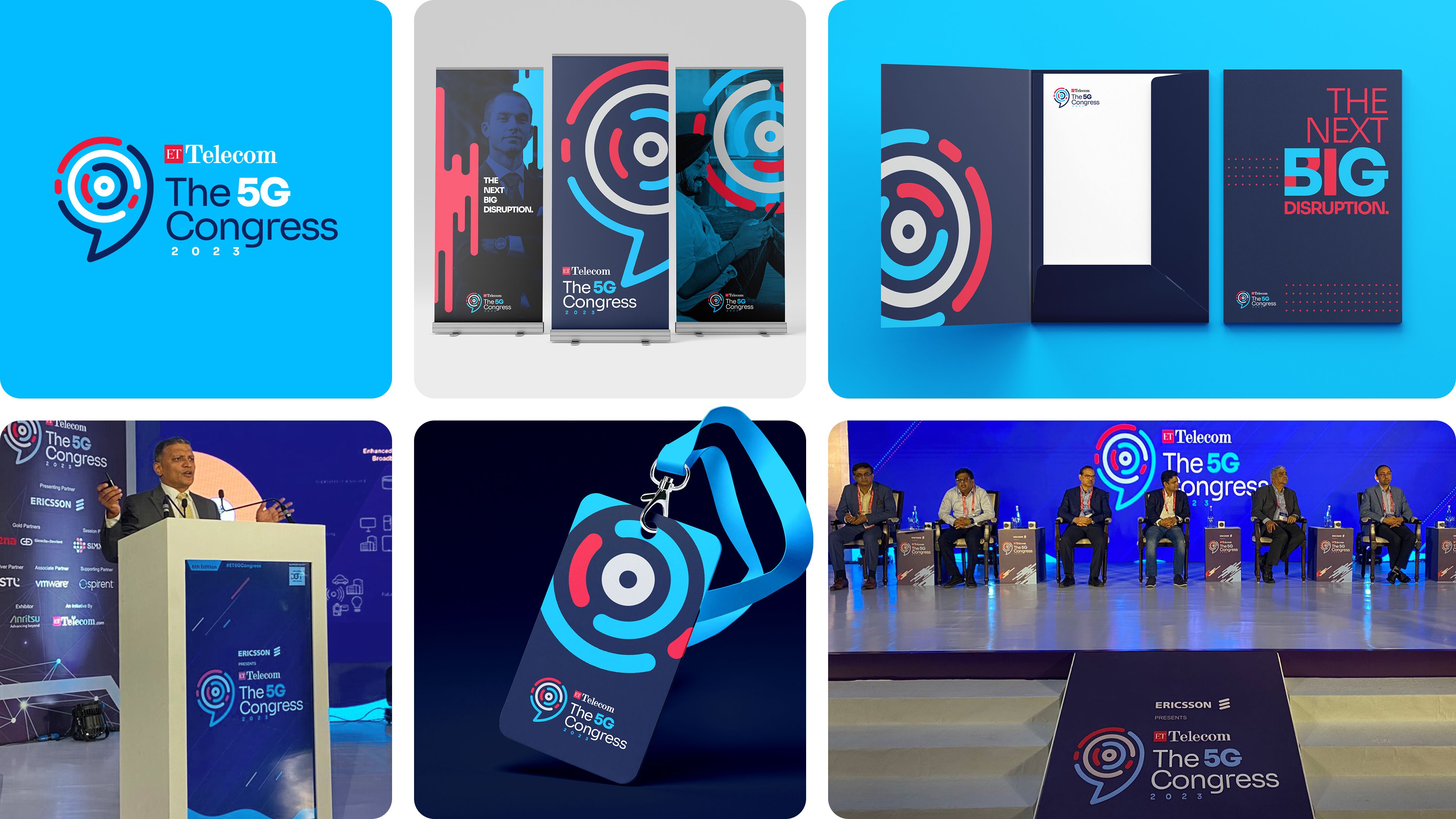
Event Identity Design
Digital and Print Collateral
Brand Guidelines


Winner
Award Logo
Challenge

As ET Telecom expanded, new IPs were created without a shared structure or design logic. Each developed its own visual identity and tone, making the ecosystem feel disjointed. The lack of a unified framework meant the brand could not carry forward its recognition or goodwill across sub-brands. With more IPs planned, the disconnect was only set to grow. ET Telecom needed a single, scalable system that could tie its expanding portfolio together and strengthen its position as a leader in the telecom space.

Solution

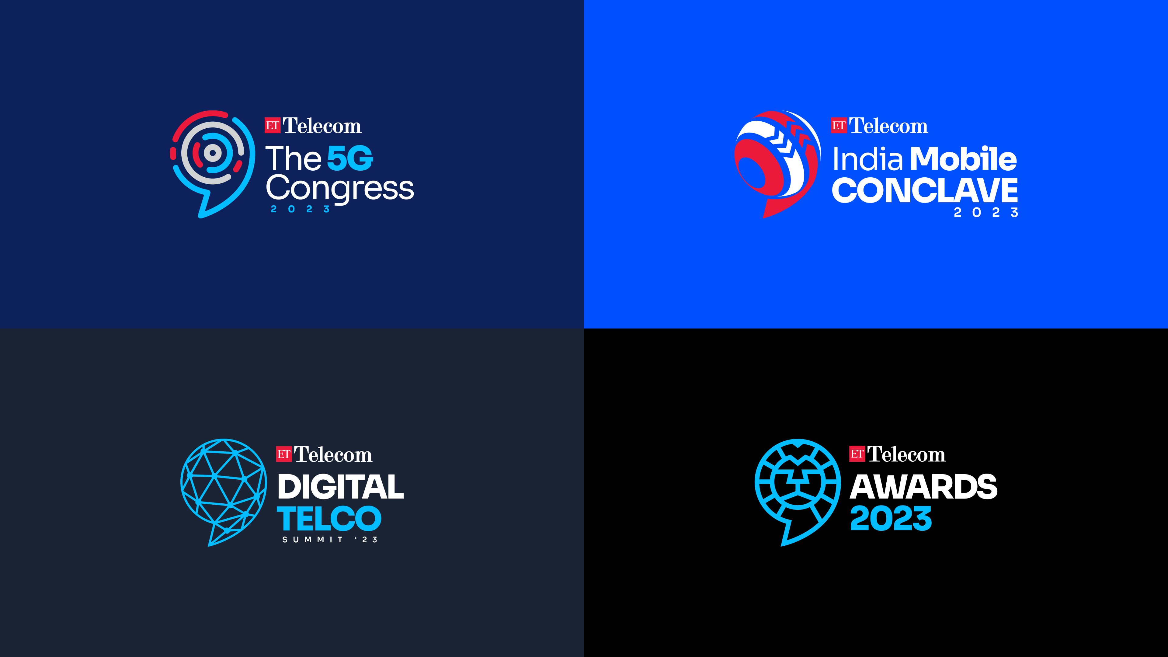
Dreamjar developed a brand identity system that brought all IPs under one consistent visual language. The foundation was the speech bubble, a universal symbol of communication and connection. It became the fixed element across all IPs, while the inner form changed to reflect the nature of each IP. ET Red served as the common thread, and varied blue tones gave every IP its own voice. The system created clarity, consistency and room for future expansion, allowing ET Telecom to maintain unity across its growing range of initiatives.

When one of the biggest names in telecom needed connection of its own.

ET Telecom has long been the voice of India’s telecom industry. It brings together leaders, innovators and policymakers to shape how the nation communicates. Over time, the brand grew into an ecosystem of events and initiatives, from the 5G Congress and Digital Telco to India Mobile Conclave and the ET Telecom Awards. Each had its own tone and look. New IPs kept getting added without one guiding system, and the brand’s ecosystem began to feel fragmented. The visual language didn’t carry forward ET Telecom’s goodwill, and the link to the parent brand grew weaker. They realised that as more IPs emerged, the disconnect would only grow. That’s when they turned to Dreamjar to build a brand identity system that could bring consistency and growth back to the brand.

Slide
Slide
Slide
Slide

The paradox of modern technology.

Telecom runs on invisible forces. Signals, networks, data and code move silently between us, making connection possible yet leaving nothing tangible to hold on to. Designing for that world meant finding a symbol for something you can’t see.

That question opened a wider thought. Most modern technology still hides behind symbols of the past. The floppy disk still means ‘save’. The magnifying glass still means ‘search’. The paperclip still means ‘attach’. The paper plane still means ‘send’. Even the camera icon we tap to take photos still looks like an old film camera.

The irony is that as tech becomes less physical, its icons become more nostalgic. People trust what they recognise. Familiar shapes turn complex systems into something human. So instead of chasing what looks futuristic, we started asking what has always stayed relevant.

Progress doesn’t always mean looking forward. Sometimes it means returning to what never changes.
And if every era of tech has its own icon, what could become the timeless one for ET Telecom?

Slide

No matter how much telecom evolves, it will always come down to communication.

Every breakthrough in telecom, from the telegraph to 5G, has been about connecting people. Instead of chasing futuristic shapes and modern tech symbolisms, we went back to the most universal symbol of dialogue: the speech bubble. It is timeless and instantly understood. It has appeared everywhere, from comic strips to chat apps, always standing for communication. For ET Telecom, it became both symbol and statement. The bubble can also be interpreted as a quote mark, representing exchange and voice.

The bubble formed the base of the new brand identity system, bringing every IP under one idea. Telecom will keep changing, but communication will always stay the same.

Slide

One form, many voices.

The new design system turned a single idea into a working structure. Every part of the identity was built to balance consistency with individuality. The parent lock-up stayed fixed, binding every IP to ET Telecom through a clear visual hierarchy. Within it, the bubble silhouette remained constant, while the inner details changed to represent each IP’s focus and theme.

ET Red acted as the thread that held everything together, carrying the heritage and strength of the brand. Each IP was given its own shade of blue, creating a visual rhythm across the family. The typography stayed clean, ensuring legibility across digital and print formats. The system was designed to scale, ready to host future IPs without losing its visual DNA.

Slide
Slide
Slide

ET Telecom 5G Congress

Built around speed, movement and connection, the 5G Congress identity drew from signal waves that shape the speech bubble. Layered arcs suggested range, bandwidth and low latency. Space Blue anchored the system, while Sky Blue and ET Red added energy.

Slide

ET Telecom Digital Telco

Digital Telco marked the shift from hardware to software and the rise of connected systems. The logo used digital nodes linking together to form the bubble, symbolising networks and communication. Sky Blue, ET Red and Prussian Blue gave the palette a modern tone.

Slide

ET Telecom India Mobile Conclave

The India Mobile Conclave identity focused on mobility, exchange and progress. The inner form of the bubble used moving arrows to show how information flows between people and technology. Electric Blue set a futuristic tone, while ET Red added strength.

Slide

ET Telecom Awards

The ET Telecom Awards identity celebrated leadership and excellence in the telecom industry. The lion symbolised courage and vision, echoing the strength of the awardees. Unlike the other IPs, black dominated the palette, with Sky Blue and ET Red adding contrast.

Slide

The difference it made.

Not every rebrand is about creating a spectacle. Some are about creating order. ET Telecom didn’t need a louder voice, it needed a language that could hold everything together. The kind of design that keeps working long after the excitement fades.

Oh, and this project went on to win India’s Best Design Project Award 2023.